The late film executive Bingham Ray, may he rest in peace, once shared a revelation with me during a lunch at Orso in 2009. It was something so obvious that I had completely overlooked it. Ray explained that the cleverest movie marketers try to establish a color scheme for their films. Take, for example, the movie “Juno,” which had orange stripes with distinctive green highlights. “Little Miss Sunshine” was bright yellow. Even the first “Austin Powers” film chose a velvety wine red against gold, surprisingly subtle for such an outrageous comedy. These colors ignited excitement and anticipation. The rest was up to the film itself.
Little did we know that twelve years later, our entire post-literate, increasingly tribal, identity-obsessed culture would also become color-coded. What was once a branding device reserved for sports teams, street gangs (as seen in the movie “Colors”), and the St. Patrick’s Day parade, has now become our dominant form of nonverbal communication.
Blue or red no longer solely represent the Crips or Bloods. Entire states have become red for Republicans, blue for Democrats, or a grapey purple for swing states. Green has become the code for those who love the planet. Black stands for Black Lives Matter. Blue and yellow symbolize Ukraine. The rainbow represents Pride, and an inclusive version of the rainbow includes black, white, brown, and pastel colors for super-inclusive Pride.
In 2023, your color palette defines you. You are your palette.
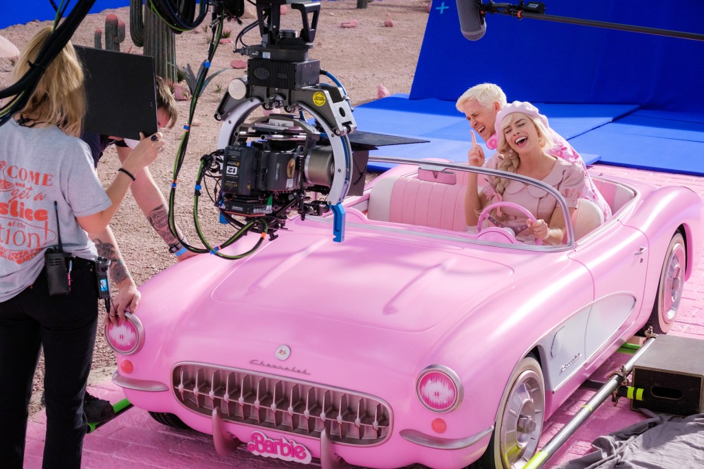
Speaking of movies, this highlights the brilliance of Warner Bros. in fully embracing pink and all that it represents – The Eternal Feminine. Just search “Barbie” on Google and you’ll be greeted with a blinding flash of pink stars. Admittedly, a recent nuclear pink social media meme prompted apologies, but it only amplified the phenomenon. At this point, you can’t even look at Pepto-Bismol without thinking of Margot Robbie. And the pink campaign has gone beyond the initial phase. I recently saw a young women’s volleyball camp having a blast with a pink day, with even the coach sporting bright pink shorts.
When it comes to movie marketing, it doesn’t get much better than that.
Fortunately, the folks over at Universal are no slouches either. They know how to sell movies using color. Remember, this is the studio that successfully used earth-tones to make a hit out of “The Sting” back in the color-muted Seventies. For “Oppenheimer,” the marketers cleverly chose flaming tangerine, even hotter than flame red and wild enough to hold its own against all that pink.
But with so many colors already claimed, what’s left for the rest of the film calendar? Perhaps “Napoleon” could work with the Tricolor, or the classic French colors of red and black. “Ferrari” could utilize its namesake’s black stallion on a golden shield, or go with the checkered flag. “Killers of the Flower Moon” will have to find its palette in the spring green and burnt gold of the prairie.
“Aquaman and the Lost Kingdom” has already claimed deep blue, while “The Color Purple” has dibs on royal purple for the season. “Blue Beetle” has indigo-ultraviolet.
As for me, if it’s still available, I’ll take seafoam. Because when you have nothing to sell, every day feels like a leisurely walk on the beach.